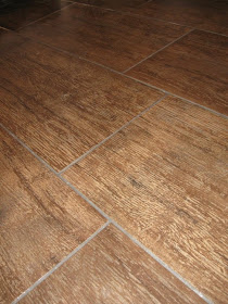
I had a request from Lori for more pictures showing our bathroom tile. I have a couple of posts with some information about them. The one in March probably has the most information.
I have added a few pieces to my master bathroom over the past year and never posted about them. So... an updated bath post is in order.
The tile in the hall bath was my first choice. I love the light color. The tile width is 6 inches. Hey - my shower curtain looks crooked!
The hall bath has a pedestal sink, beadboard with a ledge and a hanging cabinet that needs a makeover. I love the shower curtain in this room. It's made of hemp and requires no liner. That's no issue - we don't use this shower. I would love to use it in our master bathroom, but the color wouldn't work there right now.
The master bath has a similar look - same pedestal sinks and beadboard. Lots of white. I like the vintage look. I don't like the light fixtures - particularly the globes. I'd like them better with plain globes, but they have a special way to connect and I need to special order replacements. That's been on the back burner for ages.
The vanity was purchased about a year ago. I looked for ages and never found exactly what I wanted at a reasonable price. I wanted more drawers. This piece doesn't have the storage, but it looked nice, fit perfectly, and the price was right. I have especially enjoyed the lift-up top. Our kitties can't knock things off.
I love the flowers on the ledge. Before taking these photos, I had some tidying to do. I moved a bunch of bath products off the ledge. It was looking pretty messy. I found these bottles at a yard sale this past weekend and had just put them out in the kitchen. They didn't look right there, but mmmmm... I love them here. If not for Lori forcing me to stage my bathroom and pretend that it's always neat and tidy, I wouldn't have discovered that these vases BELONG right there. Thanks Lori!
This silly rug obviously doesn't belong in a bathroom. In our quest for rugs all over the house (so our senior dog with bad hips can walk easier) we ended up with this rug and discovered it fit perfectly here. I thought this was going to be temporary but until I find anything I like better, it's staying. It doesn't match the yellow and blue things I had started pulling into this room, but oddly, I like it. Plus, it's nice and cushy.
The cabinet under the window was purchased this year, too. I like the beadboard in the door. It provides extra storage. The curtains are a make-do fix. I had them from the previous house. I still haven't decided how I want to go color-wise in this room, so for now, I'm just using what I have.
Here's a closer look at the master bathroom tile. I went with the dark tile for more drama, but felt sure it would show dirt and floating fur. I also felt sure I wouldn't like it as much as the light tile in the hall bath. Wrong. It hides dirt well and I love the dark look.
Here's a better look at the tile in the hall bath. It's only shiny because I gave it a quick mop just before taking the photos.
I love both of the looks. I highly recommend them both. They would look fabulous in any room. The tile is Havana by Mediterranea. The colors we used are Tobacco and Tropicana. There are more colors to choose from as well. There are two widths -6 inch (which we used in the hall bath) and 12 inch (which we used in the master bath. The tiles are 24 inches long, so they look like planks. They truly look like planks - we have fooled lots of guests. We've had so many compliments on them.
I have linked to the following parties:
White Wednesday at Faded Charm Cottage
Show & Share Day at Just a Girl
Be Inspired at Room to Inspire


