My dear, sweet, wonderful husband made a towel rack for me. I have been looking for a towel rack with character ever since we moved in (3 years ago). Little did I know we had everything we needed right in the barn.
He attached 3 very old glass doorknobs, which came from my grandmother, to a piece of very old, weathered, wood that came from his Uncle Clyne's barn. I love the distressed condition of the wood - great character!
He drilled recessed hole in back so the knobs would hold firmly, yet sit flat against the wall.
I had a painting that I've been trying to find the right spot for. It's in a barnwood frame my sister-in-law gave me. It's goes perfectly with the towel rack.
Unfortunately, my lousy photo doesn't do either justice, but trust me - they look wonderful!
November 30, 2011
November 18, 2011
Decoupaging a Divider Screen
Every now and then, I do a project that turns out so good, I can hardly believe I did it. One of my most recent projects was to decoupage a divider screen. The divider turned out great and is now being used in my booth.
I bought the screen at a yard sale. It was in various stages of a redo involving paint and wallpaper.
I decoupaged one side with old yellowed dictionary pages. I used matte Mod Podge on this side. This side is facing my neighbor's booth.
The other side - the most fun side - was decoupaged magazine ads. I used old magazines from the 40's and 50's.
I found so many quirky ads. Even tough I personally chose and cut out and attached each ad, I still find myself browsing the screen to revisit them.
There were tons of ads for retro colored appliances - loved those!
Unfortunately, right now not much of the screen is showing in my booth. I have my booth pretty full. Oh well. It'll show better later. Meanwhile, it still makes me happy.
November 17, 2011
Mantel Redo
The mantel I refinished this month just sold. It didn't last long in The White Booth.
I came very close to keeping this one. It doesn't matter that we don't actually have a fireplace. After all, I've seen loads of inspiration for Faux Fireplaces.
In the end, we decided against using it. Once that decision was made, a redo was called for. It looked lovely with the oak finish and I had some serious qualms about putting paint on a piece that looked this good natural. But the truth is, unpainted mantels don't sell as well as painted ones. And if I wanted to put it in The White Booth (TWB), then it needed to be a very light color. We use creams and greys in TWB, too, but, even though I'm on a gray kick right now, I decided to paint it white.
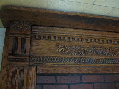
Here are some photos of the transformation. This isn't a redo where the before look is ghastly. As you can see in the before photos, it looked wonderful before. The only thing I didn't like at all was the faux brick. That came off very easily. Some people will likely think the before look is the best. It all depends on your style.
The people I bought the mantel from had gone to a great deal of trouble to removed years of paint and bring it back to its glory. Even now, knowing it came out pretty, I feel pangs of guilt. Too late now. And a sale was made to a customer I adore - Bonnie H. So that's enough remorse.
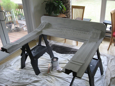
After one coat of primer, it looked pretty sad. This is always the low point in a redo where you wonder what the heck you've done.
Another coat of paint makes it look much better, but it was pretty bland.
All those details were just begging to be highlighted. What to do? Glaze? No. I wanted it to be white. Distress. Yes.
After it cured for a bit, it was time for the debut in TWB. It was put in place right around our booth transformation date. The fall naturals had been pulled and the booth was very plain and clean looking. It looks really nice like that, too.
A few days later, TWB was transformed with glitz and bling. The booth looked great and the mantel was fabulous! Everything on the mantel sold within 2 days. It had to be re-glitzed.
I came very close to keeping this one. It doesn't matter that we don't actually have a fireplace. After all, I've seen loads of inspiration for Faux Fireplaces.
In the end, we decided against using it. Once that decision was made, a redo was called for. It looked lovely with the oak finish and I had some serious qualms about putting paint on a piece that looked this good natural. But the truth is, unpainted mantels don't sell as well as painted ones. And if I wanted to put it in The White Booth (TWB), then it needed to be a very light color. We use creams and greys in TWB, too, but, even though I'm on a gray kick right now, I decided to paint it white.
Here are some photos of the transformation. This isn't a redo where the before look is ghastly. As you can see in the before photos, it looked wonderful before. The only thing I didn't like at all was the faux brick. That came off very easily. Some people will likely think the before look is the best. It all depends on your style.
The people I bought the mantel from had gone to a great deal of trouble to removed years of paint and bring it back to its glory. Even now, knowing it came out pretty, I feel pangs of guilt. Too late now. And a sale was made to a customer I adore - Bonnie H. So that's enough remorse.
After one coat of primer, it looked pretty sad. This is always the low point in a redo where you wonder what the heck you've done.
Another coat of paint makes it look much better, but it was pretty bland.
All those details were just begging to be highlighted. What to do? Glaze? No. I wanted it to be white. Distress. Yes.
I liked this look. No need to do anything more.
After it cured for a bit, it was time for the debut in TWB. It was put in place right around our booth transformation date. The fall naturals had been pulled and the booth was very plain and clean looking. It looks really nice like that, too.
A few days later, TWB was transformed with glitz and bling. The booth looked great and the mantel was fabulous! Everything on the mantel sold within 2 days. It had to be re-glitzed.
Farewell, pretty mantel. I know you'll be happy in your new home.
Subscribe to:
Comments (Atom)


