March 26, 2012

A White Booth Redo

I am aching all over.  The White Booth Girls did a major booth redo today.   I have more photos on The White Booth Facebook page.  But here are a few of my favs -

We put a ruffled Christmas tree skirt on our mannequin.
I love the  color and feel of this vignette.
Two doors flank the wide entry area.  This one has one of my signs on it.
This one looks great with heather's bench.

I'm too tired to add more, but you can see all you want by clicking on the links at the top of this post.

March 25, 2012

Kitchen Cupboard Before and After

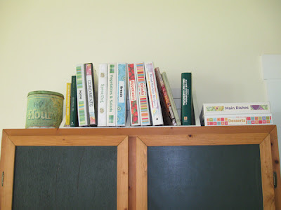
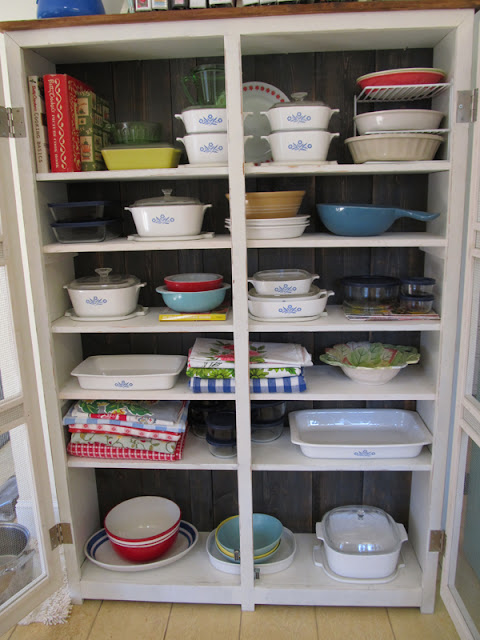
Holy Cow!  What a difference!  My wonderful hubby and I did a makeover on a cupboard he'd made years ago.  At the time he made it, function was the priority.  But now, it's functional and fabulous!!!


My previous house had very little functional kitchen space.  I had to get creative and store kitchen goods in other places around the house.  He made this cabinet with closed doors to go in another room without appearing too kitchen-y.

The doors were mostly plywood.  The back was plywood.  Yuk. 

When we moved, it was put in the kitchen, but I was keeping my eye out for a better piece.  I hardly ever took photos that included this cabinet.  I had a heck of a time finding one to show you.  The photo above was taken about a month after we moved. 

This photo shows a closer view of the awful plywood doors I thought about painting this cabinet many times, but, truthfully, I didn't think I could improve on it that much.  I just wanted it replaced.

Thankfully, I never found anything that would function as well as this one, so instead of replacing it, we decided to make it pretty. 

The main part of the makeover was getting rid of all the plywood.  Rudy made new doors (obviously the biggest improvement) and attached heavy screen for a vintage look. It was his idea to use the hot and cold knobs for handles.


By the way, I have to say that my dear hubby has been coming up with some brilliant ideas and suggestions lately.  I really wish he'd get into this makeover stuff for my booth because honestly, he'd be amazing!  He's always been incredibly gifted at building, but now he's become a bit of a genius with the creative design bit as well.

I was adamant that the plywood back should be replaced by planks.  We are both very happy with the results on that, too.

Most of the cabinet was painted white (mixed with calcium carbonate to make chalk paint) and sealed with clear wax, but the planks on the back were painted gray - also made into chalk paint, distressed, and sealed with brown wax.  I love how the grain came through.  The gray background really sets everything off and feels more interesting to me than a solid white cupboard.

Note:  Wax is great for finishing most chalk paint projects, but when I paint something that will get more wear and tear, like on a kitchen table, I prefer a poly topcoat.  It still looks great.


Rudy added a top which overhangs the main cabinet.  It's totally for looks, but it was totally worth the effort.  I painted it white, distressed it, then stained and sealed it with brown wax. It appears more brown that white. I wish I'd taken a picture of it because it's a really nice color, too.  Too bad no one but me will see it - when I climb up on a step stool to dust.  (Which means I'm not likely to see it all that often).

One other big improvement -  Rudy added a few more shelves on the inside.  I had used lots of plastic-covered-wire-stacker-things before in order to make the most of the space.  Having plenty of wood shelves is soooooo much better.  (Joan Crawford voice-over) NO MORE WIRE SHELVES!

I had a great time putting things back in the cabinet.  At first I filled the cupboard with mostly my collection of Cornflower Corning.  Many of these dishes were my grandmothers, so even though I had a colorful look in mind, I wanted to give it a try.  As expected, it wasn't the look I wanted.


Next, I weeded out the corning, keeping out just the pieces I used most frequently.  Then I pulled out things I had tucked here and there that were both functional and nice to look at.  Those were placed first.  Then I put in a few things that were very functional and OK to look at.  Last, I put in some things that I'll hardly ever use, but they bring me lots of joy to look at.  My tablecloths fall into that category.  Most all of these came from people who are special to me.  In fact, just about everything in this cupboard has stories behind them. 


I think this piece is now my favorite piece of furniture in the house.  It has so many memories attached to it.  It was made with love, made over with love, and filled with things I love.

March 23, 2012

Sewing Theme Vignette

I put together a pretty sewing vignette in my booth at Rockin' B.  I had been thinking about this one for a little while. 

I was supposed to build the top for the sewing machine base myself.  Rudy was giving me lessons.  Truthfully, he pretty much did it.  In the midst of the lesson - just when he was going to show me how to put on the sides - I got a phone call.  When I got back, he'd finished it.  It's super sturdy.  We both liked it so much that we would have liked to have kept it.  I just didn't know where we could use it. 

I love my newest wood sign - a vintage sewing machine drawn in silver over a black background.  This is another sign that I secretly hope doesn't sell.  One day, I'll run out of room for my signs and I'll have to bring some home.  This one will go in my loft!

The machine in the sign is incredibly similar to the real sewing machine I have for sale in my booth.  I paid too much for the real one - it was pretty and I lost my mind. The price was great if I were planning to keep it, but too much to resell.  When it sells I won't make a dime, but it sure looks great in this vignette.

If it never sells, I am considering turning it into a lamp.  I think that would be pretty amazing, but since the machine is in great condition, I feel like I'd be breaking a "vintage code of honor law" to mess with it.  There are some things you just shouldn't re-purpose.  Is this one of them?

You can also see my blue and white booth sign in the photo above.  At Rockin' B, many of us are moving away from just being a number (I am 188).  We are literally and figuratively making a name for ourselves!

March 22, 2012

New Blog Header

I had a snow scene on my blog header and it had to go.  Georgia pretty much skipped over winter and we are sailing through Spring.  Everything is blooming or has just finished blooming.  A film of yellow pollen is covering everything.  I'm wearing shorts and walking around barefooted.  A snow scene wouldn't do.


I had nothing in mind for a header - just wanted a change.  I'm into signs right now and decided to play around with a bold sign-like header.  I started with a stark black and white. Well, it certainly was an attention getter.  I also made it a bit too large.  

I re-sized it, softened the corners, took out the swirls and changed the background color.  It's better.  I could no doubt improve it, but it's my bedtime.


I do like the picture of my loft inside the letter F.  It's a photo from 2008 before anything was in the room.

I like change, so I suppose I'll leave it this way for awhile.

March 17, 2012

Lazy Day

Our babies certainly know how to make the best of a lazy day.  They also know how to lay claim to the best spots in the house. 

Little Bit
Sissy
Sissy is exhausted.  She helped me do some bookkeeping today.  Then I turned on the TV and Animal Planet (her favorite channel) was showing a special on the cutest kittens of 2010.  Sissy went wild over that program.  By the way, Sissy is not a cat.  She is a human trapped in a cat's body.  I'm convinced.

Annabelle's favorite spot is Rudy's lazy-boy.  She sneaks into it every chance she gets.
It doesn't show well but Annabelle is wet from her swim in the pond.  She had a roll in the mud after that.  I'm really glad that chair pad is under her!

Sweet Sadie
Sadie feel strongly about the big dog bed in front of a big sunny window.  Unfortunately, Lulu (not shown) feels strongly about that bed as well.  Whoever claims it first, gets it.  For that reason, sometimes even when food is involved, Sadie won't leave the bed for fear of losing her spot.

Annie and Sadie celebrated their 1 year birthday last weekend.  The dogs had a party complete with humongous bones.  A good time was had by all.

Coco, arguably the smartest dog on the planet, doesn't have a lazy bone in her body.
Cindy Lou - "Is this picture taking stuff really necessary?"

March 8, 2012

My Favorite Sign So Far - The Ball Mason Jar

I love, love, love my latest sign.  It's a large picture of a vintage blue Ball Mason Jar.  Someone said it reminded them of an Andy Warhol painting... sort of like his Campbell's Soup painting.  My hair is looking a bit like his these days, too.  Ha! 


The idea of painting any two wood signs alike doesn't appeal to me, but if this one sells, I may have to make an exception.  I was torn about even putting it up for sale.  I'm hoping to create more signs soon - enough to fill the walls of my booth.  Then I'll bring this one home!

By the way, I can't take full credit for the artwork.  I used a picture of a jar I found on Graphics Fairy to create this.   That sight can lead to all sorts of wonderful projects!

Here's another I finished this week -


It's a little smaller and easier to handle.  On the downside, it was just as much work as making a large sign, but I won't get as much money for it.  Bummer.  These are not quick projects.  On this one, I particularly liked the font for EGGS.  My least favorite part are the circles.  Handing painting a smooth circle is not easy!  Will I ever master that brush???    I'll pretend that it adds to the charm and hand-painted folk art look.

Update:  I decided I couldn't let the ball jar sign go.  I love it too much.  It's now on my marigold cupboard.


Linked to Funky Junk Interiors Saturday Nite Special party - the topic is mason jars!!!

March 4, 2012

A Vintage Wooden Tooblox

I came across an old wooden toolbox that a lady was wanting to sell.  It had a great shpae, but was made of plywood, which I'm not fond of.  Still, it had possibilities.


I painted it green and added a chalkboard area.  I kept it at home long enough to create a pattern to make another.  My hubby wanted the ones we make to be a little different.  The bottom wouldn't show in front.  It would be completely tucked inside.  I got another tool lesson and we built another one.  My cutting was a little off and I made the two ends a little taller than I intended.  The next one will be shorter.

I'm keeping the one we made.  It's in our family room on top of an armoire.  I'd like another for the porch and another in my loft.  I could think of lots of places to use them.  I could even make one to go in the bathroom to hold toilet paper! 

I don't have photos of the one we made and am too lazy to go take them.  I'll be making more soon.

March 1, 2012

Moved to a New Booth... AGAIN!

I cannot believe I moved my booth again.  I have promised myself to stay put for a long while this time.

I did have good reasons for the move.   I need wall space for my signs.  My new booth is the same size as my previous one, but it has an extra 5 feet of wall space.  The location is good and it happened to come available at exactly the time I needed it.  Isn't it wonderful how things often work out that way?

My sweet sister-in-law, Nancy, helped with the move again.  She volunteered.  What would I do without her!  She made the move lots of fun, but we were both worn out by the time we finished.

I did manage to take a few photos afterwards -


There are till areas I know can be made to look better.  There are also things I need to take home and things I need to bring in.  But mostly, I want to get some more signs made to take advantage of that wall space!

LinkWithin

Related Posts with Thumbnails